


Oppo Find 5 Review
Rabu, 13 November 2013
Oppo, a little known brand in the world of smartphones is actually an up and coming player in the consumer electronics world, based in China. Started very recently in 2004, the company has dabbled with Blu Ray players, LCD TVs and various other consumer electronics products and had taken up to smartphones with the launch of the Oppo Finder last year, once the world’s thinnest smartphone and now, the Oppo Find 5. The Oppo Find 5 is, by all means, a flagship product. With great design, build and hardware specifications backing the device, Oppo has the audacity to make it one of the best Android hardware on the planet, but has it? Lets find out.
Video Review
Box Contents -
Right from the beginning, Oppo has vowed to impress us, and that starts with the box itself. Built like a premium jewel box, it definitely wowed us. Have a look at the our unboxing post for more details.
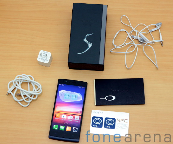
You get the phone, the SIM ejector tool accompanied by user manuals in a slick compartment, a stereo headset with mic, a micro USB cable and a compatible power plug inside the box. Additionally, you get configurable NFC smart tags for personalized functions in a single tap.
Design, Build and Ergonomics
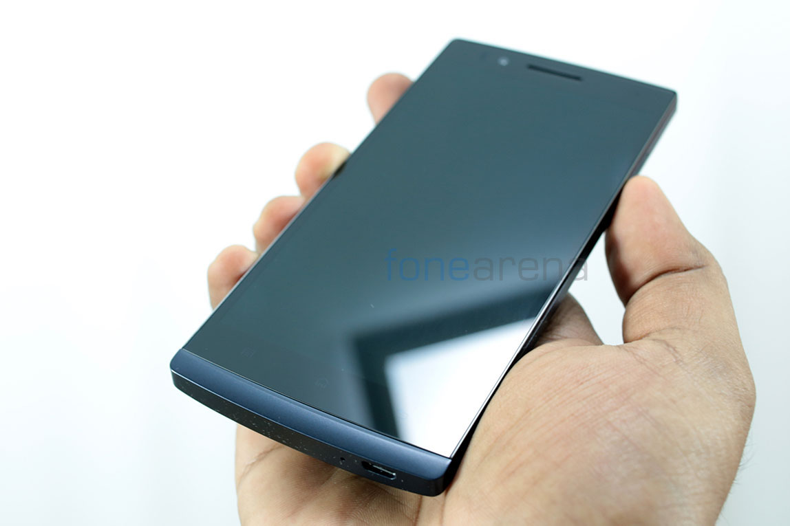
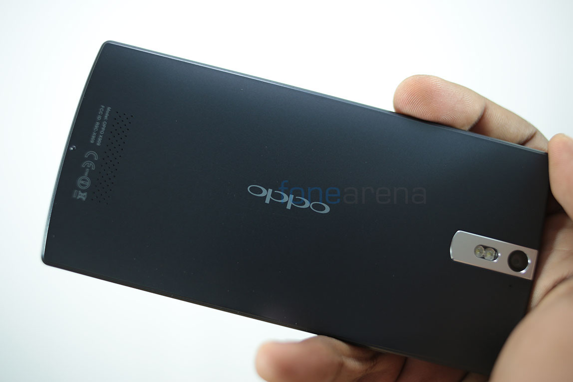
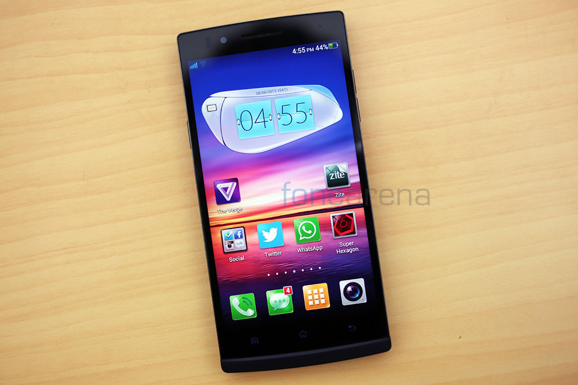
A simple way to describe the design of the Oppo Find 5 in two words would be “Stealthy dark”. We have the midnight black edition and it is an absolute looker. The device is not exactly black though, it has a very dark blue tone to it, much like the midnight indigo sky.
Slightly curved corners and a stern flat front reminds us a lot of the Sony Xperia S, with a similar “chin” slightly protruding at the bottom of the phone.
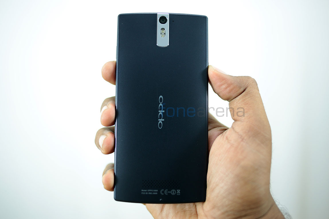
The back is slightly curved to fit nicely with the hands, with a beveled outline meant to give it an unique look. The whole “invisible” design makes it look really slick, especially when the display is turned off. This slick device is fit to be used by a ninja.. or perhaps Sam Fisher, because it is definitely an awesome looking device any spy would lust after. The stainless steel strip around the camera on the back adds a certain “executive” look to the device, with its plain flat presentation.
Majorly built of high grade dense plastic, the build quality of the Oppo Find 5 is unparalleled by any other plastic based smartphone on this planet. That includes the highly praised Nokia polycarbonate and others too. While aluminium based devices are of a different breed, the Oppo Find 5 redefines how plastic based smartphones can be, and it is of excellent build.
The glass on the front is surrounded by a thin raised strip of aluminium, painted in black. While it may prove to be a minor hindrance while taking calls, it is otherwise a good decision, for the sake of the glass. Even the buttons on the sides are of very high quality, like the ones you usually see on a high end Blu Ray player. I guess that’s where Oppo took their design cues from. Made from a single piece of dense plastic, the body is solid and has no moving parts.
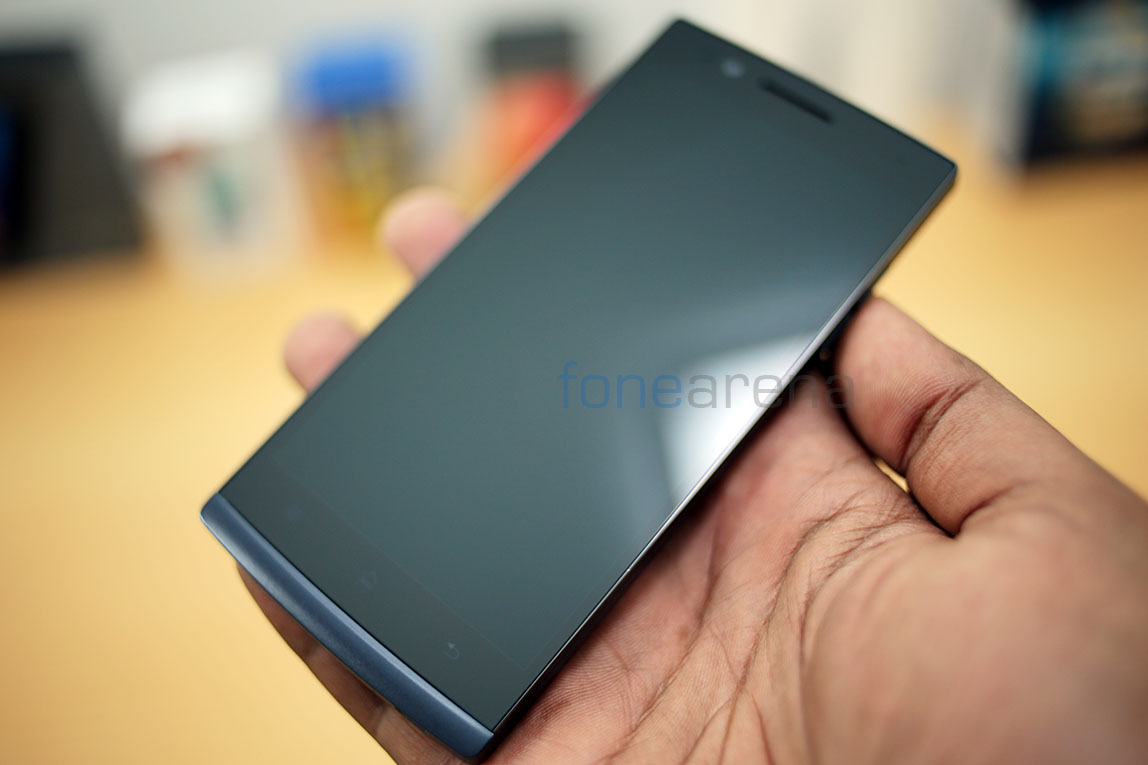
Being a 5 inch device, the ergonomics are bit on the negative side. While the extremely thin bezels make it super narrow and easier to hold in one hands, the overall height of the device makes it hard to fit into denim pockets, mainly the front sided ones. Most of the times, especially while riding on a bike, I consciously adjusted the device so that it would be sideways and not straight, which would have meant the device jutting out of my pockets. And no, front shirt pockets are a no go. Also, thankfully there are no controls on the top of the device.
Coming to the dimensions, the device is just 8.9mm thick and weighs 165g. Due to the smaller surface area, the weight actually becomes noticeable. While it is not a dealbreaker in any way, the device reminds you now and then that it is built like a tank and you wouldn’t wanna break someone’s head with it. Advantage of the weight is of course the extremely reassuring build quality, a good compromise we guess. Overall, the Oppo Find 5 is a slick stealth tank in terms of design, build and ergonomics. Lets move on to the hardware walkthrough then.
Hardware Walkthrough
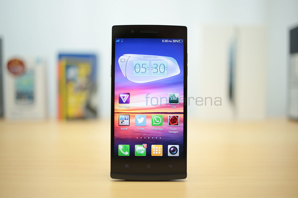
The front is dominated by the 5 inch full HD IPS display with the glass covering it. The display has an ultra thin bezel with almost an edge to edge perception.
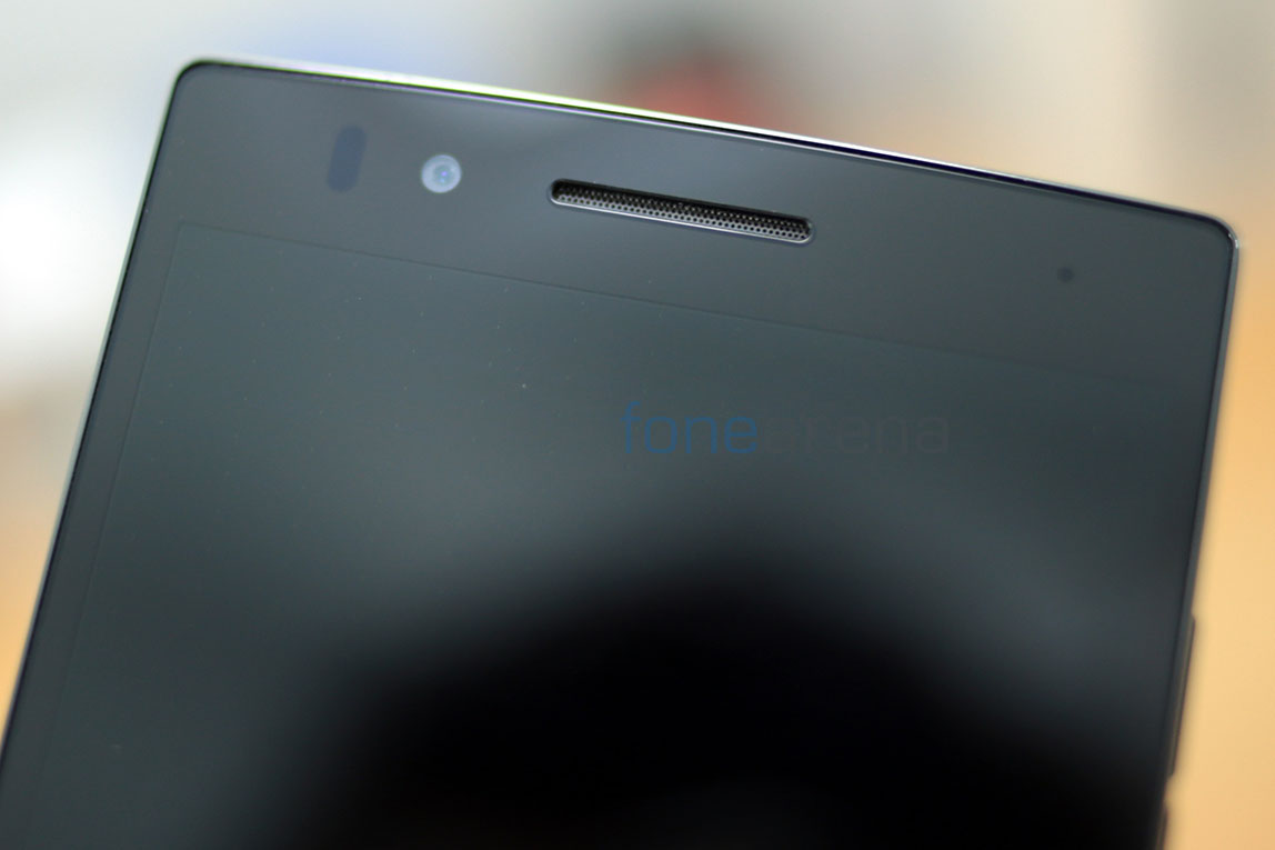
Above the display you have the 1.9 MP front facing camera, the ear piece and the usual pair of sensors. Additionally you have a notification LED too, which is the small dot on the right.
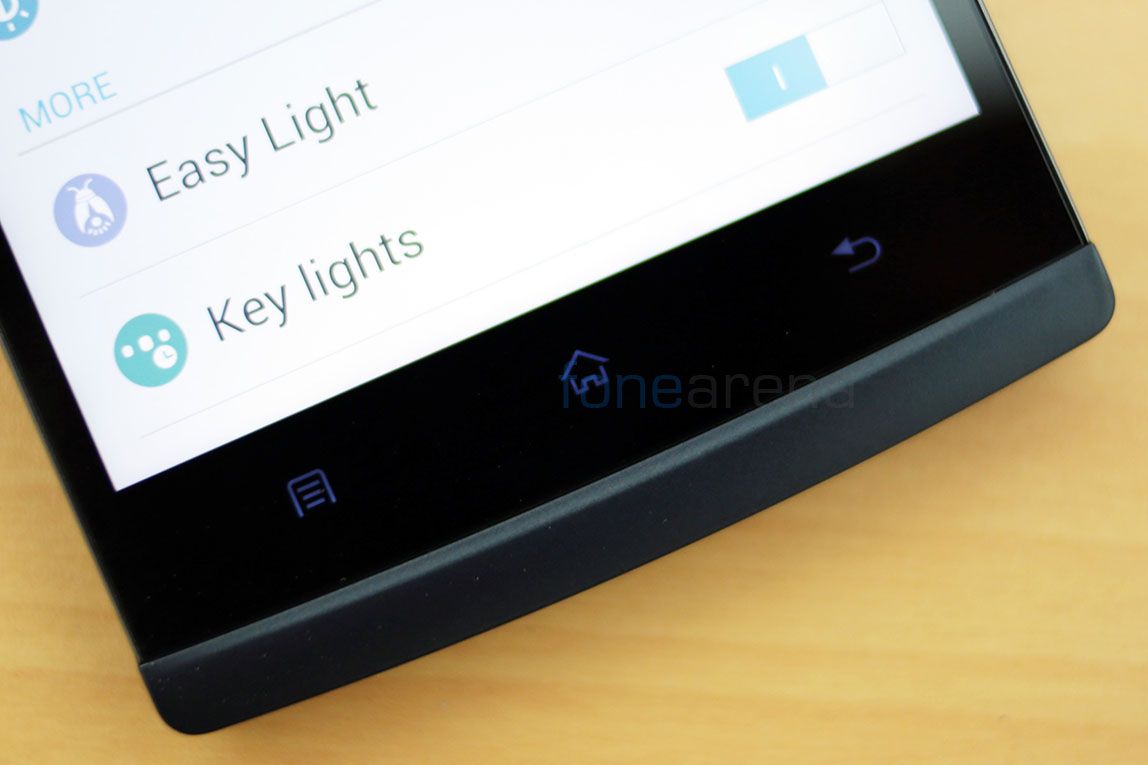
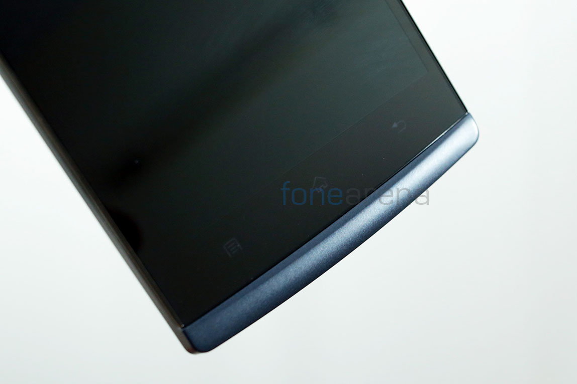
Below the display resides the three capacitive Android shortcuts that light up along with the display. One major inconvenience with the capacitive shortcuts is that they are very close to the display. So close that most of the times I was pressing the home key instead of the space bar on the keyboard. It was annoying at first and then I learned to be careful and thank goodness for Android’s multitasking prowess, most of the stuff I wrote in a message were still there after every mistake.
The display, the components and the capacitive buttons all are engulfed by a single piece glass that runs edge to edge till the bottom chin part, which in turn is a continuing part of the back. As we saw earlier, there is also the extremely thin aluminium strip runs around the glass on three sides, with a very slightly raised rim protecting the glass.
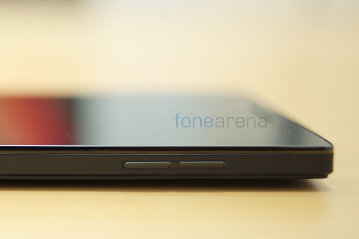
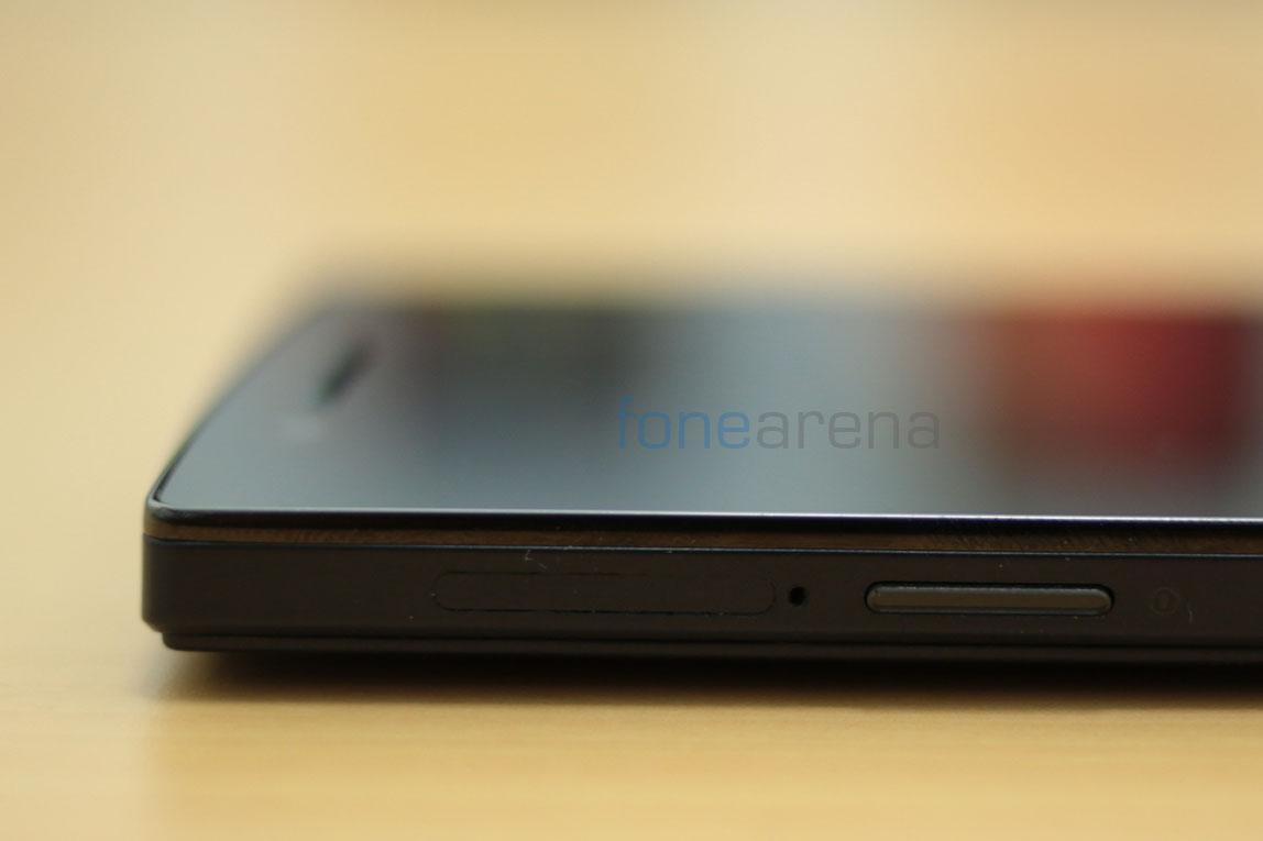
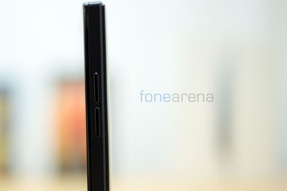
On the right side of the phone, you have the volume rocker, which have a bit of a shallow key press and also work as unlock keys, hence eliminating the dependence on the power key which is placed on the left side of the phone.
Interesting to note that Oppo has made the button placement comfortable for left handed users than the right handed ones. While it was disorienting at first, I slowly got used to it, mainly thanks to the accidental presses of the volume rocker waking the screen.
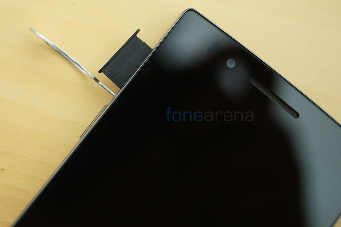
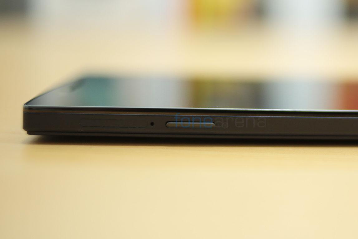
Also on the left is the slot with a micro SIM tray which opens with a pin(given in the box).
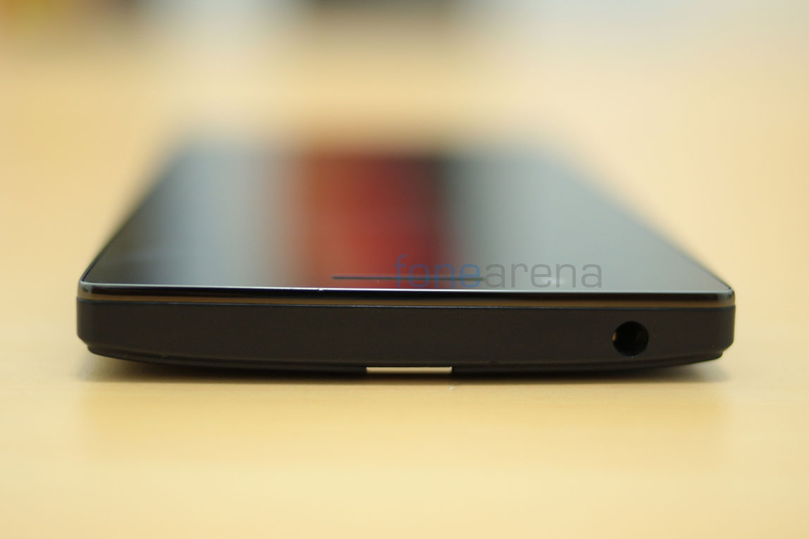
Over at the top you have the 3.5 mm audio jack placed leftwards off center.
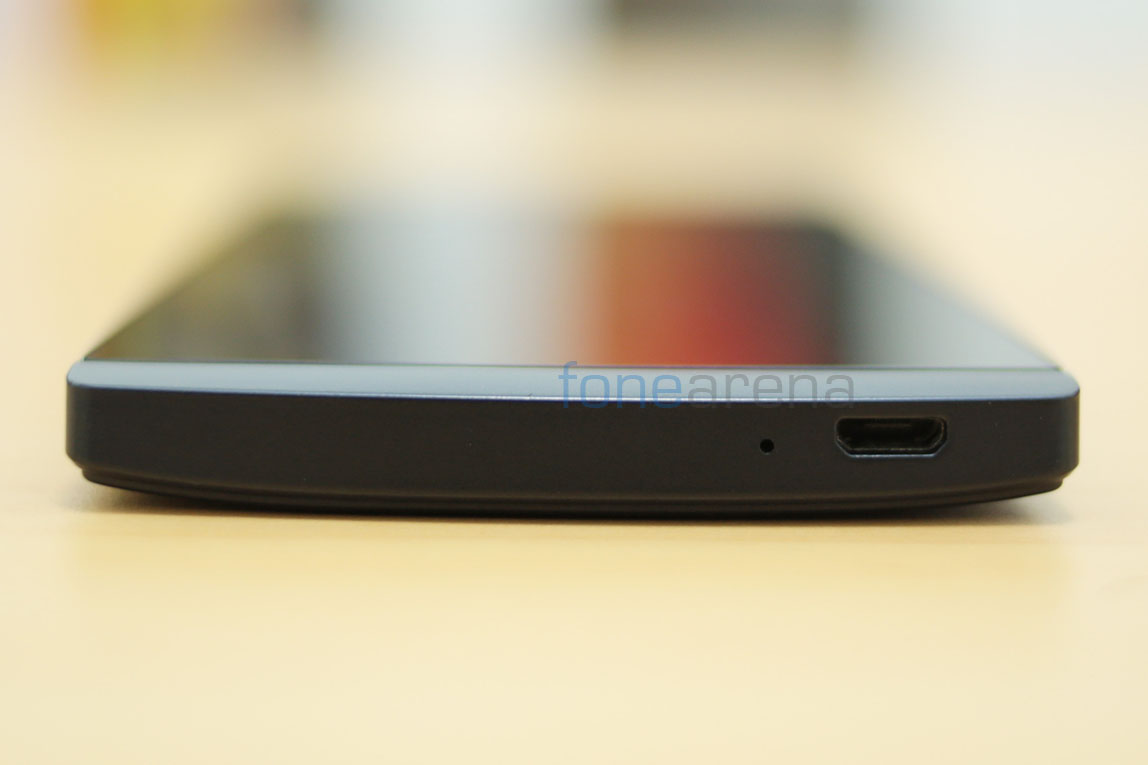
Over at the bottom you have the micro USB port for PC connectivity and right besides it is the primary microphone for voice calls.
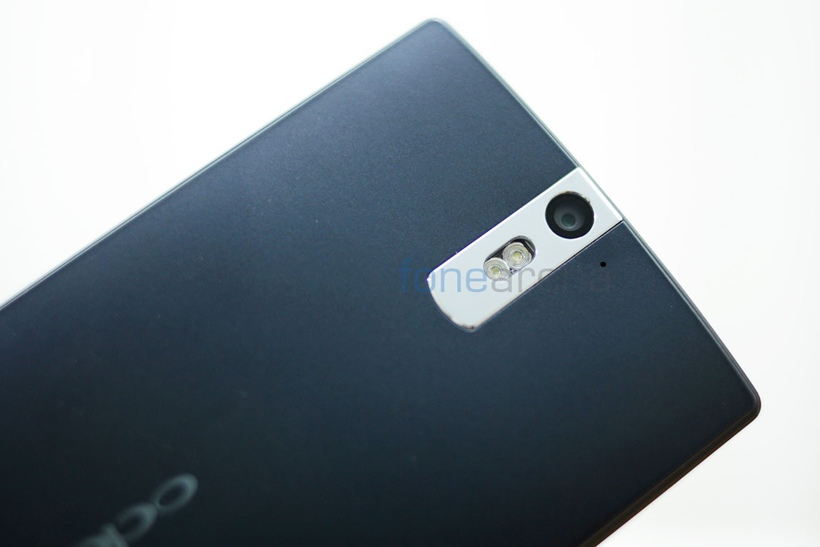
At the back of the phone is the 13 megapixel camera unit with dual LED flash housed in a stainless steel camera strip. Even the camera strip is nicely beveled and is scratch resistant. Accompanying the camera is the secondary microphone for stereo audio recording in video. Down below, you have the amazing loudspeaker that has Dolby-enabled hardware for crisp and loud audio output. More on that later.
So that’s it for the hardware walkthrough, lets jump into the juicy details then.
Display
Initially when we witnessed the Oppo Find 5 at the Mobile World Congress, there was one thing that completely stood out and that was the display. It’s no different now, and it’s easily one of the best displays we have seen on the market. Spanning 5 inches in the diagonal and sporting a crazy 1920×1080 resolution, the IPS LCD panel has all the ingredients for terrific performance. The display is closely bonded to the glass, in fact one of the closest bonding we have seen and that makes it look like the display is floating on the surface of the glass. Oppo calls this OGS(One Glass Solution) technology. The technology, which we feel is one of the outstanding features of the display, is explained in a brief animation promo here -
samsung galaxy s4
Between the “eye tracking,” air view, air gestures, Easy mode, IR Blaster and endless camera features, the Galaxy S4 is a marketing director’s dream come true. This smartphone does it all—and every feature is surely destined to be the star of some spunky marketing campaign at some point. And even as far as the end experience for the user is concerned, being overwhelmed by features isn’t necessarily the worst thing in the world either. Really digging in and exploring all the features will take you days, if not weeks—as will going through the rows and rows of pre-installed apps in the app drawer.
But the elephant in the room question remains: Is the Samsung Galaxy S4 a phone you should buy instead of an HTC One or an iPhone 5?
Hardware: A brain, a body, but no soul
With the Galaxy S4, Samsung is moving its line of flagship smartphones into the yearly smartphone update, a trend set by Apple and the iPhone just a few years ago. That means a significant hardware update might not come until 2014, while the Galaxy S4 is a software-minded, backend update (much like the iPhone 4S was). Very few Galaxy SIII owners are going to be out there wanting to update. After all, the two phones look almost identical.
With the Galaxy S4, Samsung is moving its line of flagship smartphones into the yearly smartphone update, a trend set by Apple and the iPhone just a few years ago. That means a significant hardware update might not come until 2014, while the Galaxy S4 is a software-minded, backend update (much like the iPhone 4S was). Very few Galaxy SIII owners are going to be out there wanting to update. After all, the two phones look almost identical.
Unfortunately, in terms of how this thing is put together, that’s not meant as a compliment.
With its slippery, fingerprint-attracting plastic casing and altogether flimsy build, the Galaxy S4 feels disappointingly cheap. When you tap on the back of the phone, it reverberates in your hand as if it’s hollow. It’s a brain and body with no soul. While it’s fantastic how thin and light they trimmed the Galaxy S4 down (although it is still not as thin or light as the iPhone 5), it comes at the expense of the feel of the phone. This has always been one of Samsung’s problems and the Galaxy S4 makes no effort to feel more like a robust, premium smartphone. Handsets like the HTC One, the iPhone 5, or even the Lumia 920 are just on a completely different level in terms of design and build.
That being said, the Galaxy S4 most definitely is not hollow. This handset comes with a killer quad-core Qualcomm Snapdragon 600 and 2GB of ram that compete neck and neck with flagship competitors at almost every turn. In other words, there is almost nothing you can do to slow this machine down. Apps open quickly, the keyboard is responsive and video plays flawlessly. I tried my best to make the system stutter—even splitting the screen between an HD YouTube video and scrolling through my Twitter feed at the same time felt snappy.
Equally impressive is this phone’s display. When the hordes of contract renewers make their way through the Verizon or AT&T store, the Galaxy S4’s 5" 1080p display alone will catch people’s attention. AMOLED screens aren’t for everyone and Samsung’s “Super AMOLED” display has some of the same screen quality quirks such as the unnaturally high contrast and funky color accuracy. Furthermore, I found that the screen had a hard time shining through sunlight despite the fact that Samsung claims that their Super AMOLED screens reflects five times less sunlight than its predecessors. But between the HD resolution and the super thin bezels, the Galaxy S4’s display packs a punch that is sure to make good first impressions with buyers.
Software: Overwhelmed by features and cheesy graphics
Of all the OEM Android skins out there, Samsung’s “TouchWiz” GUI has always been one of the most intrusive. Everything from the twinkly unlock screen to the cheesy 3D homescreens insist that TouchWiz isn’t poised to make a major move in the direction of stock Android anytime soon. Minimalist design has never been Samsung’s strong suit and the cluttered UI of the Galaxy S4 is apparent right from the get-go.
Of all the OEM Android skins out there, Samsung’s “TouchWiz” GUI has always been one of the most intrusive. Everything from the twinkly unlock screen to the cheesy 3D homescreens insist that TouchWiz isn’t poised to make a major move in the direction of stock Android anytime soon. Minimalist design has never been Samsung’s strong suit and the cluttered UI of the Galaxy S4 is apparent right from the get-go.
When you start up the phone for the first time, you are greeted by a host of help screens and tutorials, all of which are necessary if you hope to get through the host of Samsung and carrier apps. As with many Android phones, the battle for content hosting is displayed within the phone itself. Samsung, Google and your carrier all want you to buy your next movie or song out of their own app store and all want an app presence on your home screen. Opening the app drawer on a brand new Galaxy S4 is like opening the drawer in your desk where you keep all the random things that don’t belong anywhere. It’s a total mess. So take my advice here: Uninstall what you can and move all the Google apps to your home screen. There’s absolutely no reason to get involved in Samsung’s ecosystem or work through any app that Google has a version of.
The home screen widgets in TouchWiz are similarly distasteful. Many of Samsung’s own widgets such as the clock, weather, calendar and app shortcuts look like they are screenshots of an image. Strangely enough, Samsung’s comprehensive graphic overhaul of Android doesn’t cover the widgets because many of them stand out like a sore thumb. No matter how hard I tried, I couldn’t find a combination of stacking and placing these widgets together to make them not look totally out of place. Samsung might be the only company who grossly overdoes skeuomorphism more than Apple.
The confusion goes beyond the app drawer and home screens however. Even the functionality of the phone is a bit obscured by Samsung’s desire to push Google off their phone. Whereas Android 4.1 made Google Now always just one swipe from the bottom of the screen away, Samsung puts its own voice recognition / assistant software front and center instead. A double click of the physical home button will bring up S Voice, while Google Now is accessible by a long press of the menu soft button. Which to use? Despite S Voice being considerably better than previous iterations, it is still unfortunate to see Google Now pushed out of the spotlight.
There are a few standouts from Samsung’s app arsenal, though, most notably S Health, the WatchOn TV app and the camera app. S Health is a nicely designed health and exercise app that has a lot of potential (despite it needing some additional peripherals). Meanwhile, the WatchOn TV app turns out to be a really convenient way to control simple things like volume and channel on your television. And then there is the 13 megapixel camera that takes beautiful photos and includes a number of wacky features that are all fun to play around with. Throw in a great multitasking split-screen mode and you’ve a handful of features that add small but overall beneficial functions to the smartphone. These are the features that show the wide appeal and ambition of the Galaxy S4.
On the other hand, seeing the Galaxy S4 as a “phone for the masses” is still a bizarre notion to me. It’s not straightforward in any real way. It’s not easy to just pick up and use and I would never recommend it for anyone who isn’t already very comfortable with a smartphone. But even still, don’t be surprised when Samsung sells record-breaking amounts of these devices this year. After all, there is very little that this phone can’t do. I am still left wondering who exactly the Galaxy S4 is made for.
This is the best I can come up with: If you want a solid Android phone with a removable battery, expandable storage and an impressive display, or even if you just really want a phone that you can control by waving your hand, the Galaxy S4 is for you. However, if you are average Android user looking to upgrade, I would take a serious look at the HTC One or even the Nexus 4 before picking this one up.
samsung galaxy note 2
Selasa, 24 September 2013
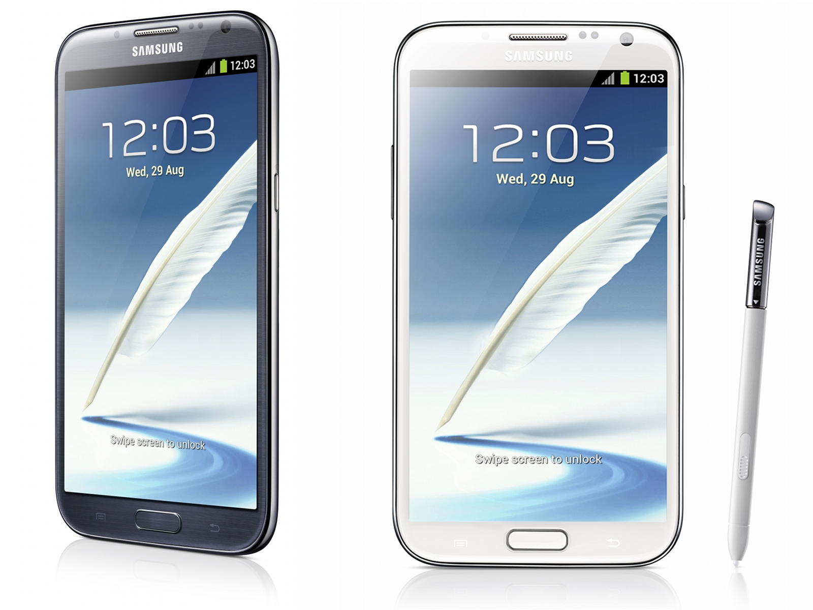
On the software side, the stylus-centric TouchWiz variant on hand is actually running on Jelly Bean and will come with a few tricks not even seen on the recent Galaxy Note 10.1. Popup Note takes the hovering widget concept, which we've seen in other TouchWiz UIs, stretched to include S Note; so notes can be taken with other apps visible and on screen. Air View introduces a new hover behavior, that previews videos and attachments in e-mails or links without the user having to open the appropriate app. There's also a few new functions users can perform within S Note, including Idea Visualizer, which inserts images based on what handwritten keywords.
Langganan:
Postingan (Atom)